A useful rundown of some of the considerations worth keeping in mind when evaluating the "green" credentials of a web host or service.
Michelle also links out to the Green Web Hosting Directory, which I've seen pop up a bit recently. It seems my own host, Krystal, isn't well represented there, which is a shame given all they're doing to reduce their environmental impact. I've reached out to the company to see if they can maybe increase their verification level.
An interesting insight into the business arc of Google from a long-time (but now former) employee. There's lots that could be gleaned about a company that infamously removed a motto of "don't be evil", though I don't fully buy the narrative presented about early Google genuinely putting users over profit (and, given the level of candour later in the article, if you're going to make those kinds of claims, you need to bring receipts). But the more interesting point here is that redundancies and layoffs are hard to walk back from. Once a company shows that version of itself to the employees, trust is shattered and company culture is destroyed. If we can learn anything from Google's attempts at "disrupting" the concept of running a company, that should be the key takeaway.
The deterioration of Google's culture will eventually become irreversible, because the kinds of people whom you need to act as moral compass are the same kinds of people who don't join an organisation without a moral compass.
A few careful thoughts about the utility of "web marginalia", in this case for discovery; things like blogrolls, feed lists, and webrings. John wonders if their demise is in part due to the loss of sidebars as responsive design/smaller viewports became the norm. I'm not sure I fully agree; I feel like most of the loss is due to the "brandification" of the web and the removal of personal space (and personality) alongside it. But regardless, I absolutely love this way of phrasing that thought:
Websites have been wind tunnelled, the edges stripped. The interesting sidebars and columns where once you would wander into new ideas from other minds have fallen far from view.
A thoughtful diatribe on the current state of web design and the web industry as a whole, with a specific focus on how the rise of that industrial complex has (possibly inevitably) reduced the craft and related skills that were once the core of these professions. Specifically, Thomas takes aim at at KPI culture, used to seek eternal growth; a culture that has homogenised web design, over-engineered development platforms, and now seems poised to be cannibalised by the AI models it has built. It's a fairly bleak take – albeit a sympathetic one – but there is a glimmer of hope. A hope that, as the industry matures, a counter-balancing craft revival may also flourish, as we have seen with so many industries before.
On the crux of the issue; on craft versus industry:
I consider this a conflict between two identities: the craftsperson and the factory worker. The craftsperson wants to do what honors the values of the craft, but the factory worker needs to do what will keep them employed or employable.
On where we are heading – a reduced industry, largely automated, with a smaller niche for "bespoke" and "hand-crafted", as with all things:
Because the craft will remain even after most of it is automated. You can order mugs online, yet there are still potters out there.
So the next time you are approaching a website, ask yourself, "What would the craftsperson do?" And also ask yourself, "What would the factory worker do?" See what answers you come up with!
A tool for generating colour palettes which are perceptually consistent in terms of lightness, contrast, and saturation. Usefully, it automatically calculates WCAG 2 contrast ratios; it also attempts to guess at WCAG 3 scores, though this remains an unknown in terms of how it will ultimately be applied (it is useful to sanity check perceived contrast versus calculated contrast, though). You can also modify the underlying colour space per colour, and set hue shifts, to stop colours morphing across the calculated gradient (e.g. prevents blues from becoming too purple, or yellows turning too green). In other words, a very powerful colour calibration tool.
A fascinating (albeit quite technical) dive into how colours spaces work, and why the typical HSL colour spaces of the web and software result in problematic inconsistencies within colours. The key is that most classic colour spaces do not account for perceptual contrast and lightness within our own biological colour space (how we perceive colours), which makes standardisation between colours very difficult. But more modern colour spaces – including LCh – are designed to account for that perceptual difference and should therefore be considered a marked improvement/preferable solution.
The Component Kitchen is a sort of app store for web components; a digital directory of useful packages, recipes, and one-shots that can be imported into your projects.
The early Internet's greatest hits. From the hamster dance to Homestar Runner; the first webcam to the first online video. It's a real trip down memory lane for those of us who grew up on this version of the internet, and for everyone else, it's a weird treasure trove of the weird and whimsical.
I'm a big fan of these proposed IndieWeb icons/logos, particularly the Protocols set. The repeated node motif is just a really solid piece of logo design – and the Salmention salmon is just adorable 😄
Just look at that adorable Salmention "salmon" with a node for an eye 😍
Need to debug an iOS or iPadOS device but don't have one? Got a Mac of some kind? Turns out, Xcode is a pretty comparable environment to the real deal and almost any mobile Safari bug can be tested – in real-time, with all the normal quick reload of your regular dev environment – and fixed using it. Sure, you still have to shell out for an expensive Mac, but if you've gone that far why not get the most out of it?
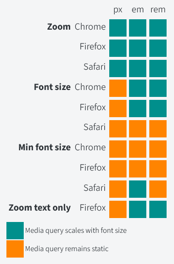
An overview of the state of media queries and accessible overrides (page zoom, text zoom, min/max font size settings etc.), seeking to determine which of em, rem, or px is the best option. Turns out that Safari is still doing things differently and still preventing their being a "winner", but pixels are your most consistent option, whilst em is likely the most broadly accessible (so really, no change).
Safari isn't even internally consistent. Why scale em for minimum font size, but not regular font size overrides?
On Safari still being the core issue:
I was disappointed to see Safari is still an outlier, where ems and rems don’t scale in media queries based on the user’s default font size.
On the reality of an inconsistent system (not sure I agree with this as a takeaway, but it does track with the data):
There is no clear-cut winner I can point to after looking at this. It probably depends on what you want to prioritize.
If you want consistency across all browsers, you should now use px in your media queries.
Wattenberger frequently breaks my brain with some of their incredibly well-reasoned and unique ideas, and this talk from AI Engineer Summit is no exception. The core ideas being introduced are around how we can infuse UIs with AI in order to create new models of data capture which could automate and streamline a whole new set of tasks. I particularly love the way spreadsheets are used as a prime example of a UI that has fundamentally reinvented entire market sectors but which we never see as wholly invasive or problematic, just a useful tool that can help bring order through structure. Why not use AI to apply the same approach to non-numeric data sources?
Workflow augmentation starts with automation. Even within Excel, most of the power is in automated and scripting away the tedious calculations necessary to build the flashy dashboards and data visualisations which help us highlight the key data we're interested in.
Data is often most useful when you can view the different levels of abstraction in an interlinked way. Amelia uses Google Maps to highlight this very well: as you zoom in or out the relevant data points change, and information is hidden or displayed in different orders to prioritise the most likely use-case at a given zoom level.
What if we could do the same with any kind of data? Zoom in or out at a whim. There are a few examples given. The first is summarisation of text, e.g. a book. If you open a book at the lowest level of abstraction, well, that's what we're all used to. Perhaps the highest level of abstraction is the contents page, index, or maybe the blurb. But in between those there are other levels that LLMs can now access. Want to summarise each paragraph into a sentence to scan-read a plot? Or zoom out a bit further and have a one-paragraph summary of each chapter to relay to a friend? And then could you utilise this capability to graph those chapters onto story models, to see whether your plot is following a typical convention or if there are outliers?
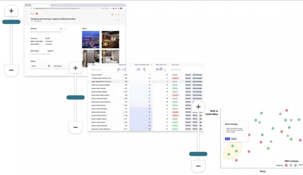
The other example is finding a hotel. We need to compare listings across various sites and likely only care about a certain subset of the data shown. Amelia is most interested in the distance to local transport hubs and a specific conference venue, the overall price of the room, how good the WiFi is, and maybe a few photos just to check it has the amenities they need. How cool would it be to have a UI which allows us to zoom out of a listing page and customise the view. It can scan the reviews for keywords and run sentiment analysis on any that match to determine how good WiFi is, for example. It can scrape data like the price and address from the page, then use open source databases to work out the distance and relative affordability. You end up with a dashboard of just the information you, specifically, need. But why stop there? Once you've ran this analysis on multiple pages, the AI could generate a spreadsheet that lets you quickly compare listings across disparate services and sites. Even more zoomed out and you can see a scatter plot that shows you which hotels score highest on all of your key criteria. And because this is AI driven, even at this level of abstraction you should be able to select a listing and send a question or book it directly, letting the AI automate away the actual process of filling out the booking form for you. 🤯
Amelia's example of an interface with three levels of abstraction.
I find it easy to think about numeric data in terms of spreadsheets, and come up with ways to cluster or show key points of information that way. A UI that could allow for that kind of data capture and interrogation across any digital source would be incredible!
I also really like the idea of these zoom-level based interfaces. It strikes me as something that you could apply to lots of information architectures – digital gardens in particular – and if you combined it with view transitions you could have some really interesting UIs, even without AI.