Explore My Notes

The modern way of serving images | kurtextrem

A very thorough overview of how to write a modern, performant, HTML-driven image component that is as optimised to serve the most appropriate image as possible. There are some very neat tricks in here, though I'll caveat it all with: the article openly admits that the native <picture> element does everything you would want, but then goes into great detail about an alternative, slightly hacky (albeit clever) workaround using the <img> element. I can understand where the author is coming from as to their reasoning for the second option, but it does seem that the final conclusion should be to use the <picture> element in almost all circumstances.

Yes, you avoid an extra element in the DOM using the <img> technique, but the <picture> element is intended for this behaviour, which means browsers will actively test for it to work (unlike unofficial <img> hacks) and any extensions to HTML will likely focus on supporting <picture> first. You can also look up what your code is doing on MDN or any other developer resource using <picture>, rather than a single blog article. In other words: short-term engineering gains and DX may lead to long-term technical debt, which feels overlooked.

On the current state of image optimisation on the web:

The HTTPArchive found at least 70% of all websites have an image as the most prominent element, yet only 34% of the web uses <img srcset> to create responsive & performant images (and even fewer use <picture>).

On the minimum feature set of a modern, responsive image component:

This brings us to the following checklist:

  • ☑️️ Serve different dimensions based on the viewport size (e.g. different images for desktop and mobile)
  • ☑️️ Serve different qualities based on the viewport size
  • ☑️️ Serve different qualities based on Device-Pixel-Ratio (DPR) / zoom level
  • ☑️️ Optional: Deliver different file formats (WebP, AVIF, …)

Example of how to use a <picture> element to achieve the above:

<picture>
  <source
    // `media` contains a CSS media query (MQ) that is used to control which
    // specific source to render (first true `<source>` wins)
    media="(-webkit-min-device-pixel-ratio: 1.5)"

    // `srcset` contains the path to an image and an 'intrinsic width descriptor',
    // corresponding to the original image width on your device
    srcset="2x-800.jpg 800w, 2x-1200.jpg 1200w, 2x-1598.jpg 1598w"

    // `sizes` consists of a CSS MQ condition and the width of the slot
    // You can also use a viewport width (`vw`)
    sizes="
      (min-width: 1066px) 743px,
      (min-width: 800px) calc(75vw-57px),
      100vw">
  <img src="1x.jpg" alt="">
</picture>
In this example, for old browsers and below 1.5x DPR screens, the 1x.jpg image is loaded. For other screens, browsers differentiate based on the viewport width, so modern phones load 2x-800.jpg, desktops 2x-1598.jpg.

Example of the <img> element replicating the native functionality of <picture>, written in an automatable way; here N, M, and A are used to mean the image widths and the minimum "mobile/desktop" breakpoint (A):

<img
  sizes="
    (max-width: Apx) and (resolution: 1dppx) Npx,
    (min-width: (A+1)px) and (resolution: 1dppx) Mpx,
    (max-width: Apx) and (min-resolution: 2dppx) (M+1)px,
    (min-width: (A+1)px) and (min-resolution: 2dppx) (((M+1)*5)+1)px"
  srcset="
    low-dpr-xs.jpg Nw,
    low-dpr-xl.jpg Mw,
    high-dpr-xs.jpg ((M+1)*5)w,
    high-dpr-xl.jpg (((M+1)*5)+1)w"
  src="fallback.jpg"
  alt="don't forget the alt attribute"
/>

On how the above works:

By combining sizes and srcset (width descriptors), we get back the control of what browsers do. As mentioned earlier, the width descriptors work implicitly, so we introduce a specially crafted sizes attribute that targets individual DPRs to help us make it explicit again. Our crafted <img> tag now behaves like a <picture> tag, with no additional tags required. We can conditionally load high quality images in different dimensions and different qualities.

On some research into how low fidelity you can go before people notice/complain:

...we’ve tested how different JPEG image qualities are perceived and found no perceiptable difference betweeen 50% and 35% quality for smartphones with 2x DPR screens. Same for 1x screens in general, where 75% works fine for us.

How to use CrystalDiskMark | Tech Illiterate

A very useful explanation of how to interpret the test results from CrystalDiskMark, as well as a solid overview of how to tweak the settings to really understand and analyse your drives.

📆 06 Jun 2023  | 🔗

  • Technology
  • CrystalDiskMark
  • hard drives
  • hardware
  • testing 

Browsing with assistive tech | Tetralogical

A fantastic series of short, introductory videos put together by the folks over at Tetralogical. Each one provides an insight into how assistive technologies and alternative browsing methods are actually used, from screenreaders (on both desktop and mobile operating systems) to magnification to voice control.

Even with extensive experience using and testing with some of these tools, I still found several things here impressive and/or interesting:

  • It will never get old hearing a screenreader running at 100% speed; so impressive that people are able to parse information out of that!
  • Excellent demonstration of both screenreader hotkeys (e.g. using H for heading navigation) and voice-controlled "mouse grids"
  • Tips on how to enable keyboard navigation in macOS

📆 02 Jun 2023  | 🔗

  • Inclusion
  • assistive technology
  • voice control
  • screenreaders
  • magnification
  • mouse grids
  • macOS
  • a11y 

Inclusive tabbed interfaces | Heydon Pickering

I've been digging into tabbed interfaces ("tabs") recently. As usual, Heydon's Inclusive Components has one of the best overviews and write-ups of the techniques used. I particularly love how Heydon breaks down ideas into logical progressive enhancement flows; in this case, that means thinking about a set of tabs as a linked table of contents followed by "sections" of content:

For my money, an embryonic tabbed interface is just a table of content with same-page links pointing at different sections of the page.

That allows a good baseline on which we can build a more "expected" visual interface for the tabs with CSS, and augment the functionality with JavaScript. The end result can be seen in this CodePen:

I have also cross-referenced with Adrian Roselli's older post (which now links to Heydon's early work on this subject) and see that the two are broadly similar: ARIA Tabs

The main takeaway here is that you should use a list of links as the tab controls, followed by a number of content sections. These are then bound together using a combination of ARIA roles, ARIA labels, and other assistive/semantic attributes (note that the inclusion of aria-controls is not consistent across implementations and should be tested):

<ul role="tablist">
    <li role="presentation">
        <a id="tab1" href="#panel1" role="tab" aria-selected="true" aria-controls="panel1">Section 1</a>
        <a id="tab2" href="#panel2" role="tab" aria-selected="false" aria-controls="panel2">Section 2</a>
    </li>
</ul>

<section id="panel1" role="tabpanel" tabindex="-1" aria-labelledby="tab1">
    <h2>Section 1</h2>
    ...
</section>

<section id="panel2" role="tabpanel" tabindex="-1" aria-labelledby="tab2" hidden>
    <h2>Section 2</h2>
    ...
</section>

On using CSS to visually hide content, even without needing a visually "tabbed" interface:

What if I used some CSS to make just the chosen section from my table of contents visible? This is certainly possible using the :target pseudo-class.
section:not(:target) {  display: none; }

On how a basic table of contents may be the better approach:

I have encountered innumerable JavaScript-driven and ARIA-adorned, fully-fledged tabbed interfaces where simple tables of content atop page sections would have done just as well. Better even, since they are more robust and efficient. But for goodness' sake make them look like tables of content. Meet the expectations you set in visual design with your semantics and behaviors.

On why you shouldn't allow the tabs to be "tabbed" using the tab key, and that left/right arrow keys are a better alternative:

This problem is solved by delegating tab selection to arrow keys. The user is able to select and activate tabs using the arrow keys, while the Tab key is preserved for focusing contents within and below the active tab panel. To put it another way: Tab is not for tabs, which I concede is a bit confusing.
It's equally important that pressing Shift + Tab returns the user to the selected tab.

On ensuring non-visual users aren't forgotten. If we're altering tab order for keyboard users to be able to go from a tab selection directly to the content of that tab, then we should do the same for non-visual users as well by ensuring the common use of the down arrow is handled correctly:

Instead, we can intercept the down arrow key press and move focus programmatically to the open panel itself, making sure it isn't missed.
Although sighted keyboard users are less likely to use the down arrow key, it's important the focused tab panel has a focus style to indicate a change of focus location.

On dealing with tabbed interfaces on narrow viewports (responsive design):

A tabbed interface needs a breakpoint where there is insufficient room to lay out all the tabs horizontally. The quickest way to deal with this is to reconfigure the content into a single column.

On why switching to an accordion is probably not the best idea (though I'd argue that completely swapping out one component for another here would be a logical solution, and could provide a better UX, so long as it's well tested to ensure that the way the component is used is similar for all navigation methods):

Some have made noble attempts to reconfigure tabbed interfaces into accordion interfaces for small viewports. Given that accordions are structured, attributed, and operated completely differently to tabs, I would recommend against this.

📆 25 May 2023  | 🔗

Optimising for INP | web.dev

Google have recently announced a change to their Core Web Vitals metrics. The existing FID stat is being sunset, and replaced with a new way of measuring responsiveness: Interaction to Next Paint, or INP. Overall, it seems like a solid upgrade, with a better focus on real-world experiences (though I'd be lying if I said I fully understood the complex analysis being done to derive the final value).

Looking over the optimisations guide, there are definitely going to be some interesting new use cases for some of the performance-related additions to CSS and HTML, such as content-visibility, but the big hits look like they're going to come to some of my "favourite" negative trends of modern web dev (insert maniacal grin emoji here):

  • Large DOMs will be hit, which means there's now hopefully a strong(er) incentive to use semantic elements and avoid <div>-itis (and, by extension, UI frameworks that utilise dozens of wrapping elements or verbose class-name-to-element transformations);
  • SPAs will be hit, with Google openly stating that there's not much that can be done here;
  • Interestingly, I'd predict hydration could be hit even worse, as part of the metric measures how often a user clicks on an interactive element that isn't yet interactive, which feels more likely where hydration is being used. Though good use of loading states may alleviate that;

Some of the other suggestions around minimising "layout thrashing" and using timeouts to postpone non-visual updates on event listeners are interesting, but a bit beyond my level of JS optimisations.

📆 11 May 2023  | 🔗

  • Frontend
  • INP
  • core web vitals
  • web performance
  • Google 

How to view a website as Googlebot | Moz

A very thorough article discussing how to convert a Chrome browser into an SEO testing environment, through a combination of browser settings and third-party add-ons. I personally like the idea of setting this up as a Chrome "profile", so you can load it and just begin testing, without resetting everything each time. Alternatively, the article suggests using Chrome Canary for the test bench.

In brief, this works by using the following steps:

  • Install the User-Agent Switcher extension
  • Grab the latest Googlebot user-agent string from the Chrome dev tools (Menu -> More Tools -> Network Conditions -> User Agent -> Uncheck "use browser default" -> Select "Googlebot" (or similar) from the dropdown -> Copy the string shown
  • Add that string to User Agent Switcher as a new User Agent (Googlebot, paste string, Bots & Spiders, Replace, GB <-- these are the settings I used, can differ) and then select it from the plugin
  • Disable service workers in the Chrome dev tools (Applications tab -> Service Workers -> Check "Bypass for Network")
  • Disable local cache (Dev tools menu -> More Tools -> Network Conditions -> Check "Disable Cache")
  • Disable all cookies (chrome://settings/cookies) and privacy-infringing APIs (chrome://settings/content) i.e. Location, Camera, Microphone, Notifications, and Background Sync
  • Disable JavaScript (suggestion is to use the Web Developer extension)

They also suggest using a VPN to test from the US, as that is where Googlebot comes from. Similarly, the NoJS Side-by-Side bookmarklet is suggested as a good way to quickly test the site with JS running or not (seeing as Googlebot can now use JavaScript in some scenarios).

📆 26 Apr 2023  | 🔗

  • Nuts & Bolts
  • Chrome
  • web crawler
  • spider
  • testing
  • SEO
  • Google
  • user-agent 

Keep stuff linkable | Crash Lime

The bulk of the article is about a kind of pseudo-scraper for populating links and references whilst writing a blog post or article. But the broader conversation piece here is whether linking in an age of LLM-driven content is still needed, to which I and the author agree: it is. Now more than ever. Not because linking serves any specific purpose in terms of differentiating humans from machines (LLMs are just as capable of generating linked Markdown etc.), but because, as Crash Lime writes, doing so should help build a "Web of Trust"; a web of verified information, which is known to be at least relevant. That is something LLMs (and, indeed, search engines) stand less hope of pulling off... for now.

On the ending of an Age (and just a really fun way of describing the situation):

Perhaps we’re at the end of the old-web, now a corner relegated to hobbyists, as all text ever written is absorbed in a single differentiable scream.

On the concept of a "web of trust":

Remember that you are not just linking, but building a Web of Trust. Links need to be a signal that cuts through the noise, not vice-versa.

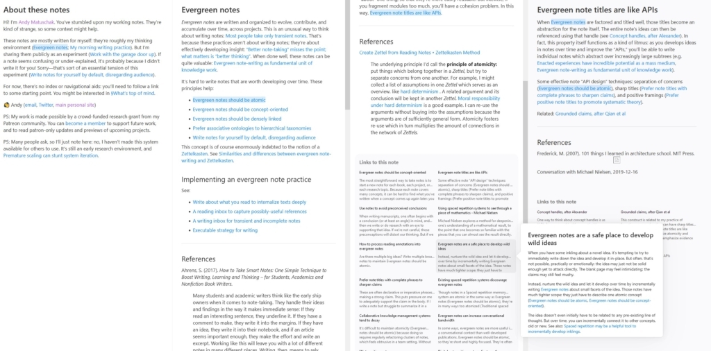
A brief history of the digital garden | Maggie Appleton

Maggie's writing is always fantastic, and their thoughts on digital gardens are always worth reading. The history here is nothing new to me personally, but does present it in an ideal manner. I also found myself thoroughly agreeing with their "patterns" of digital gardening. Just a great article, full of quote-worthy comments, on a topic that continues to intrigue.

On where the concept of digital gardening originated:

If anyone should be considered the original source of digital gardening, it's Caufield. They are the first to lay out this whole idea in poetic, coherent words.

On the benefit of a true web of information, sprawling as it is:

You get to actively choose which curiosity trail to follow, rather than defaulting to the algorithmically-filtered ephemeral stream.

On the way digital gardens tend to form bi-directional links and rabbit warrens of interconnected information:

Gardens don't consider publication dates the most important detail of a piece of writing. Dates might be included on posts, but they aren't the structural basis of how you navigate around the garden. Posts are connected to other by posts through related themes, topics, and shared context.
One of the best ways to do this is through Bi-Directional Links – links that make both the destination page and the source page visible to the reader. This makes it easy to move between related content.

On the shift that occurred in blogs, as they morphed from personal (yet public) journals into reverse-chronological personal branding exercises:

We act like tiny magazines, sending our writing off to the printer.

On the difference with a garden:

Gardens are designed to evolve alongside your thoughts. When you first have an idea, it's fuzzy and unrefined.

On how we use social media differently (I'd never really considered this, but it feels very true):

We seem to reserve all our imperfect declarations and poorly-worded announcements for platforms that other people own and control.

And I adore the concept of a chaos stream within that same context:

Things we dump into private WhatsApp group chats, DMs, and cavalier Tweet threads are part of our chaos streams - a continuous flow of high noise / low signal ideas.

One final, clever analogy between digital spaces and agriculture, specifically discussing how digital gardens should use multiple mediums, not just rely on text and links like a Wiki:

Historically, monocropping has been the quickest route to starvation, pests, and famine. Don't be a lumper potato farmer while everyone else is sustainably intercropping.

SVG crop | Steve Dennett

An absolutely fantastic little utility site that takes pretty much any SVG and removes all of the white space. You can drag'n'drop, upload image files, or just paste markup directly into a text input, and it has worked on everything I've thrown at it so far. Occasionally the preview image is a little odd (it seems to always have a 1:1 aspect ratio), but the generated output code normally preserves the logical aspect ratio. Just super helpful, all around 👍

The Fediverse is already dead | Leonora Tindall

A wonderfully well-written look at the state of the "Fediverse", and whether or not that term has any value left in it. There's a lot of interesting history and some slightly spicy takes in here, but for me the most useful part is the framing of the distributed social graph that the Fediverse creates as a "Social Archipelago". That's just a nice term that helps visualise the reality of it all a bit better:

“The Fediverse” needs to end, and I don’t think anything should replace it. Speak instead about communities, and prioritize the strength of those communities. Speak about the way those communities interact, and don’t; the way they form strands and islands and gulfs. I’ve taken to calling this the Social Archipelago.

I will fucking dropkick you if you use that spreadsheet | Ludicity

One of the most entertaining rants I've read in some years! And whilst it may no longer be that pertinent to my current career, having been the person in charge of developing a nested, tangled mess of VBA macros and Excel sheets to partially-automate several workflows, I can also deeply sympathise 😂

On the issue of "but we're only doing this for now":

Do you know how many times I've written a script that was really only run once? Never. It has never happened across my entire career. Every single thing I've ever written has been fucking welded into the soul of every organisation I've ever worked at.

On what happens once you've opened the door to Excel:

Beyond this lies naught but trying to work out why all the numbers are wrong, only to realize that Excel thought those IDs were integers and dropped all the leading zeroes.
I've seen a multi-million dollar analytics platform that is dynamically constructed from Excel spreadsheets. Do you think that was the intention when the damn thing was being assembled? Do you think any sane person would ever want to do that? No, of course not. One script got written that could parse a spreadsheet, and next thing you know, you're running a greedy search algorithm every sprint, and it never quite makes sense to spend the time removing them.

📆 02 Mar 2023  | 🔗

The great gaslighting of the JavaScript era | Jared White

I'm not sure I agree fully with everything Jared has written here – and there's a strong feeling of bias-tinted vision to some of the claims – but I enjoyed the overall trend of the argument and felt there were a few nuggets worth saving. In particular, I do think that the heavy focus on React is churning out a generation of developers that will be underskilled once React is no longer as popular. And that the way the React community has behaved for the better part of the last decade is appalling. But I'm not quite so sure that the nostalgia towards other web frameworks is truly warranted; nor do I think the framing of front-end development as particularly useful. Like it or not, React provides a suite of APIs and tools that solve otherwise tricky problems easily. And whilst I agree with Jared's inferences that not all of the solutions it provides are actually solving for genuine user needs, some of them definitely are. So I think there's a little more grey painted into the view before me, than the black and white imagined in this piece 😉

On the disparity between the bulk majority of web development work and the online discourse around it:

There has been a small but mighty ecosystem of “influencers” peddling a sort of “pop culture developer abstractions” ethos on the web whether it’s about React, or CSS-in-JS, or Tailwind CSS, or “serverless”, or “microservices”, or (fill in the blank really)—and they’re continuing to gaslight and obfuscate the actual debates that matter.

On the role of JavaScript on the web, and in particular the issue with learning it as a foundational part of the web stack (or even worse, learning its abstractions instead of the underlying technologies like HTML and CSS):

JavaScript is not required to build a simple web site. JavaScript is an “add-on” technology if you will, the third pillar of the web frontend alongside HTML and CSS. HTML, CSS, and (eventually) JavaScript. Not JavaScript, JavaScript, and JavaScript.

On how we've wound up in a situation where we have "trends" of technology that fail to become foundations of future tools:

The problem is an industry rife with faulty thinking that assumes (a) popular technology is popular because it’s good, and (b) the web platform itself is somehow severely lacking even in 2023, so heavily abstracted frontend frameworks remain a necessity for programmer happiness.

Made By Me, But Made Possible By:

CMS:

Build: Gatsby

Deployment: GitHub

Hosting: Netlify

Connect With Me:

Twitter Twitter

Instagram Instragram

500px 500px

GitHub GitHub

Keep Up To Date:

All Posts RSS feed.

Articles RSS feed.

Journal RSS feed.

Notes RSS feed.