Jamie's bookshelf | Jamie Adams

I'm a sucker for a personal collection displayed on the web, and I really love the simplicity of Jamie's design for his digital bookshelf. An easy rating system; simple (and fast) filters; and a very refined UI that is made visually appealing by the use of the actual book covers and some nice whitespace application.
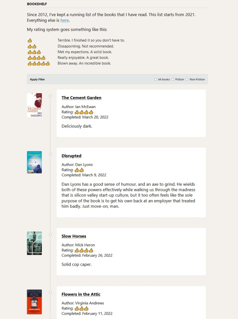
A webpage titled "bookshelf" displaying a reverse-chronological timeline, where each point is a specific book review. Each review details the book's author, title, cover, and rating (provided in thumbsup emojis on a 1-5 scale), as well as a review, many of which are only a few words long. Filters for "all books", "fiction", and "non-fiction" are provided via radio buttons at the top, and the page has a blurb explaining that Jamie has been recording the books they read since 2012, that this list starts in 2020, and how the rating system works.
Another thing I love: the way the design encourages brevity in the reviews. That's something I could happily pinch 😉

💀 NOTE: The original site no longer appears to be online; the source has been replaced with an Internet Archive link.

Explore Other Notes

  • <!DOCTYPE html> <html> <head> <title></title> </head> <body> <p>I'm a sucker for a personal collection displayed on the web, and I really love the simplicity of Jamie's design for his digital bookshelf. An easy rating system; simple (and fast) filters; and a very …</p> </body> </html>
  • Murray Adcock.
Journal permalink