
Lists with Hanging Indent and Custom Counters
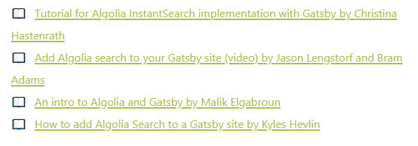
The latest addition to my site is a "further reading" section at the bottom of articles[1]. It's a simple list of sources, blog posts, videos etc. that I probably read or came across whilst writing/researching the article. As a result, the underlying HTML is as simple as it can get:
<section>
    <h2>Further Reading & Sources</h2>
    <ul>
        <li><a href="...">Link</a></li>
        <li><a href="...">Link</a></li>
        <li><a href="...">Link</a></li>
    </ul>
</section>
Nothing fancy at all, just a standard list with a header. Obviously, my actual code contains a JavaScript loop that populates the list from my content API, as well as some initialising logic to make sure it doesn't get added to pages that don't need it, but underneath it's still basically the structure shown above.
Which was all well and good, until I came to style it. Headers and links have universal styles, so I didn't need to worry about them, but for the list itself I wanted to do something that would make it stand out a little. Something that would clearly denote that this was a reading list[2]. I settled on using emoji counters of books: 📖.
The core CSS to this is incredibly simple and nothing new. You just remove the standard list-style on the <ul> element and target the <li> elements with a ::before that adds the emoji and a bit of whitespace. I've used a similar pattern many times:
ul {
    list-style: none;
}

li::before {
    content: "📖";
    display: inline-block;
    margin-right: 0.75rem;
}
That will get you something that looks pretty decent, with custom emoji counters in front of every link. If you have short links, you're probably done, but if those links line-wrap then it can look a bit messy. This is where I learned something new.
Y'see, normal list elements automatically take care of a little detail of typesetting known as a hanging indent. Basically, when you have a list of items, a hanging indent prevents text from wrapping beneath the counter or bullet. It's a simple detail that we all take for granted because almost all text editors and browsers just make it happen. It's a little bit of typographic magic. But when you remove the list-style from a list, you take away the hanging indent as well, and that just looks messy:
The problem is, there currently isn't a way to control hanging indents in CSS. There are a lot of slightly dubious negative-padding techniques knocking around, but they're not particularly neat and most of the ones I could find are at least a few years old. What with flexbox and grid, I figured there must be a better way, so I started playing around.
First, what we really have is an alignment issue. As long as you're not doing anything fancy with background colours, the counter and the <li> can functionally be considered as separate elements. Once you start thinking of it in those terms, display: flex is an obvious winner. Apply that to each <li> element and the children will neatly line up with a gutter between them, exactly like a hanging indent:

justify-content but it never seems to work.However, as you can see, there are some unwanted side effects if your list item is shorter than the container. I tried playing around with both width and justify-content, but ultimately the golden bullet was flex-grow. Set that to 1 – i.e. full width – on any children and you should be set. Depending on the actual child elements, you may need to tweak this a little, but it gave me what I wanted:

And my CSS itself now looked like this:
ul {
    list-style: none;
}

li {
    display: flex;
}

li::before {
    content: "📖";
    display: inline-block;
    margin-right: 0.75rem;
}

li a {
    flex: 1;
}
From what I can tell, this works across all modern browsers as-is[3], but if I ever find any major breaking issues I'll come back and update this post.
