
Animated Content Placeholders
As websites have become monstrous applications, pulling data in from dozens of APIs and performing heaps of client-side rendering, web developers have been left with a conundrum: what do you display once an HTTP request is finished, but the page is still building? Plenty of solutions can be found out in the wilds, from simple loading messages to spinners to approximated progress bars, but one which seems to be increasingly popular is the "skeleton" or "placeholder" layout. Here, meaningless <div> elements are loaded onto the page in place of the actual content and given a slight animation to show that, well, something is happening. If you've ever loaded Slack on the web, you'll know what I mean.
I've never quite been able to put my finger on why, but this trend makes me irrationally angry and filled with rage[1]. As a result, I've never really looked into the actual mechanics behind how it works. That was, I hadn't until today, when I needed to create one such "skeleton component" at work[2]. It was surprisingly fun and the solution I came up with felt worth noting down, so here we are.
FYI: my example is a React/NextJS component using CSS-in-JS, but the actual logic is entirely vanilla HTML/CSS so should be translatable to any tech stack with ease. I also won't be touching on how you define/record/track whether a component is in a loading state or not. All I'm interested in is creating a placeholder element I can drop onto a page and have it be visually clear that it's waiting for actual content.
The Setup 🚧
First, let's create a new component. Nothing fancy here:
import React from 'react'
import styled from 'styled-components'

const Skeleton = styled.div`
  width: 100%;
  height: 5rem;
  background-color: rgb(240, 240, 240);
  border-radius: 5px;
  margin-bottom: 1rem;
`

const ElementSkeleton = () => {
  return <Skeleton />
}

export default ElementSkeleton
You could logically switch the <div> for a <section> or some other element, too. I went back and forth on that, but ultimately a placeholder is entirely visual and aesthetic, so I felt a <div> was probably the best fit for once.
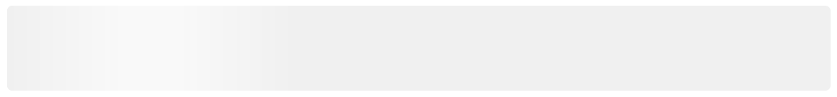
With that set up, what you get is a pretty boring grey box:

The ⚡ Flash ⚡
Let's bring that boring box to life a little and add an animated, rolling flash to show that something is churning away in the background. A lot of online tutorials and discussions about this step use a similar technique to mine, but they all require you to define some fixed widths. There are benefits to doing so, but I ideally wanted the skeleton to be as flexible as possible, so that seemed suboptimal.
The trick I settled on was using a combination of a gradient background and a pseudo-element created with the CSS ::before functionality:
import React from 'react'
import styled from 'styled-components'

const Skeleton = styled.div`
  width: 100%;
  height: 5rem;
  background-color: rgb(240, 240, 240);
  border-radius: 5px;
  margin-bottom: 1rem;

  &::before {
    content: '';
    display: block;
    width: 100%;
    height: 100%;
    border-radius: 5px;
    background: linear-gradient(
      90deg,
      rgb(240, 240, 240) 0px,
      #f9f9f9 calc(50% - 25px),
      #f9f9f9 calc(50% + 25px),
      rgb(240, 240, 240) 100%
    );
    background-size: 35%;
    background-position: 0%;
    background-repeat: no-repeat;
  }
`

const ElementSkeleton = () => {
  return <Skeleton />
}

export default ElementSkeleton
Okay, let's break that down a bit. Step one is to add a new, empty block element using ::before, an empty content value, and a strict block assignment. With both height and width set to 100% that new element will sit over the top of the existing grey box perfectly, and the border-radius will prevent any slight clipping.
Then, we add a background gradient to create our flash. The gradient itself should start and end with the colour used for the parent element, in our case that light grey (rgb(240, 240, 240)), with a lighter colour in the middle[3]. We have two boundaries for that lighter colour just to give it a defined minimum width, using calc to place it dead centre. Then you just need to tell the background to never repeat, place itself at the very start of the parent element (i.e. left edge), and give it a maximum size/width. I chose 35% but play around and see what you prefer; if you are comfortable using a more modern feature (that now has pretty decent support), I'd probably recommend throwing a clamp() function on it like so:
background-size: clamp(120px, 35%, 300px);
⬆ That should prevent the flash from developing hard edges on particularly small screens and stop it over stretching on monitors with 4K+ resolutions.
The Animation 🎬
We've now got all the parts we need, so the final step is to animate that gradient. Luckily, that couldn't be easier thanks to CSS keyframes:
import React from 'react'
import styled, { keyframes } from 'styled-components'

const loadingFlash = keyframes`
  0% {
      background-position: -250px;
  }
  100% {
      background-position: calc(100% + 250px);
  }
`

const Skeleton = styled.div`
  width: 100%;
  height: 5rem;
  background-color: rgb(240, 240, 240);
  border-radius: 5px;
  margin-bottom: 1rem;

  &::before {
    content: '';
    display: block;
    width: 100%;
    height: 100%;
    border-radius: 5px;
    background: linear-gradient(
      90deg,
      rgb(240, 240, 240) 0px,
      #f9f9f9 calc(50% - 25px),
      #f9f9f9 calc(50% + 25px),
      rgb(240, 240, 240) 100%
    );
    background-size: 35%;
    background-position: 0%;
    background-repeat: no-repeat;
    animation: ${loadingFlash} 1.5s infinite linear;
  }
`

const ElementSkeleton = () => {
  return <Skeleton />
}

export default ElementSkeleton
Tip: If you're using styled-components or a similar library, don't forget to import the necessary functionality (see the second import in the above example).
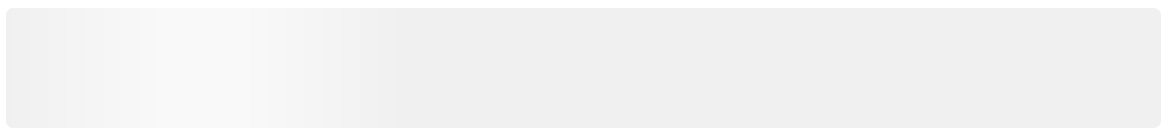
All of the magic is happening in that simple loadingFlash keyframe animation. It takes the pseudo-element and shifts it out of the left side of the frame of the grey box; the 250px value is just a little more than the total width of the gradient itself, so adjust that if necessary. Then it animates the gradient to the same amount beyond the right-hand edge over a period of 1.5s, before looping it round again. Because the animation reset happens outside the frame, it's effectively hidden from the user entirely. Here's the final result:
And you're done! 🎉
Of course, there are loads of ways that this can be improved on and extended. I strongly considered giving the component props for width and height, so that you could use the single skeleton for a wide variety of shapes. You could even add a shape prop, letting you change it from rectangular to circular or anything else you have a use-case for. That could be enhanced to vary the width of the flash based on the dimensions provided, or you could tie the whole component into CSS themes using custom properties (dark mode, anyone? 🌑).
But as a simple starting point to show a user when a component or page is still fetching content, I'm pretty happy with where this landed.
