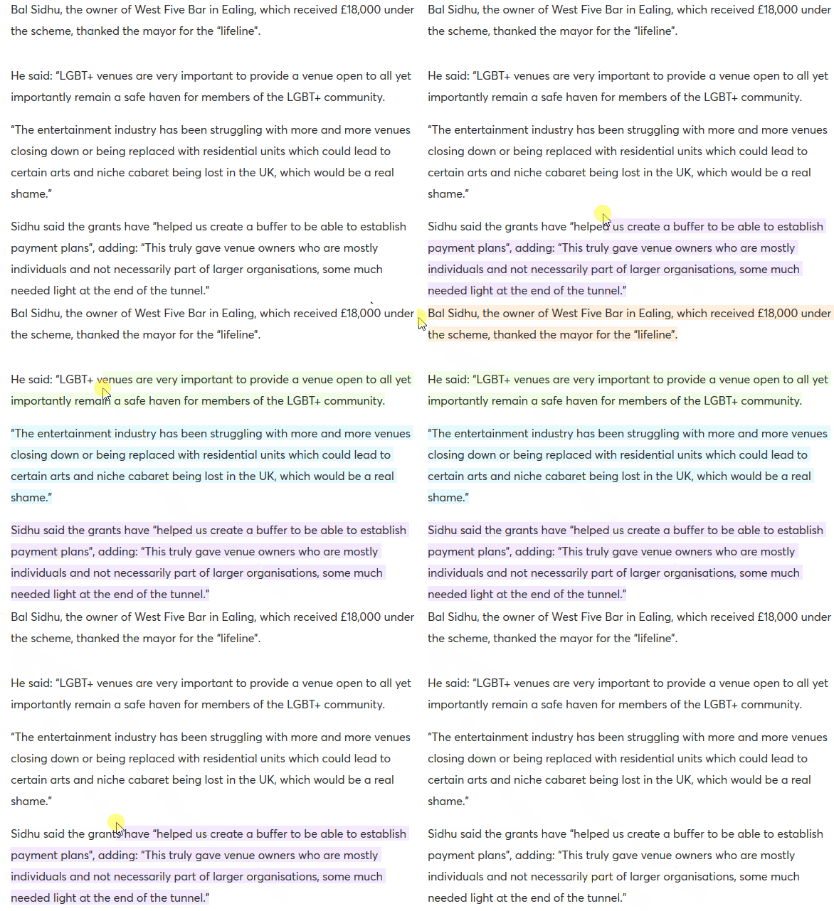
A clever UX idea discovered on Pink News: each paragraph of text has a different highlight colour, so as you select parts of an article to copy elsewhere it reveals the LGBTQA+ flag. They're using a simple CSS pattern with several similar selectors along the lines of:
p:nth-child(6n+1)::selection {
   background-color: rgba(157,236,255,0.25);
}
Extremely effective 👏
