Colour is tricky, as discussed in this chapter of Figure it Out: Getting from Information to Understanding.
- Western cultures have seven colours in the rainbow (ROYGBIV) because that's what Isaac Newton decided, based (of all things) on the Western musical scale. Seven notes, seven colours. That could explain why I (and many others) have no idea which part is "indigo".
- Languages may have thousands of words or phrases for specific colours, but in general cultures tend to settle on < 20 for common use (normally around 10). That means different cultures perceive – linguistically at least – different colours with different words.
- Russia, for example, has specific words for light blue and dark blue; they are two distinct colours. Early-modern Japanese (prior to extensive Western influence) grouped greens and blues together as one colour. The Berinmo people of Papua New Guinea see "yellow" as two distinct colours, nol and wor.
- However, it does seem that colours follow a pattern of recognition within languages. First come words for dark and light (sometimes evolving in black and white over time); then red, followed (often quite a bit later) by either yellow or green. The last colour seems to always be blue. Again, there are exceptions, but in general this trend is observable around the world in linguistic archaeology.
While we’re keen to seek out human universals, color has proven to be something that does not have consistent meaning across cultures, or even within a culture group... The meanings we point to—blue as a safe, corporate color, for example—are highly generalized assumptions, highly contextual, and mostly learned associations.
The article continues by reviewing some of the impacts colour choices can have, though interestingly one of them didn't work for me. This graph is used to show that saturation can cause information bias; the chart on the left uses colours of uneven saturation levels, the one on the right has been "balanced" for saturation:

The article claims that this causes the one on the left to become misleading, drawing your attention specifically to the orange segment and making it "pop". Weirdly, the opposite is the case for me. The left chart is very evenly balanced to my eyes and lets me take in the whole pattern very easily. The chart on the right I find very distracting, immediately being drawn to the red and purple and actively perceiving those segments as larger than they clearly are on the left-hand chart. The article argues that you should avoid the left chart as it is "unevenly perceived". Unfortunately, it seems like the right chart hits those same issues for me, so perhaps the lesson is that you're damned if you do, damned if you don't?
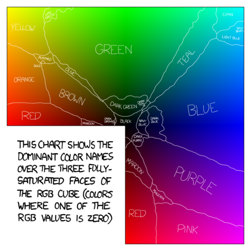
On a lighter note, they also reference this excellent breakdown of colour language in English by XKCD: