Accessible data visualisations with D3.js | Sarah L. Fossheim

A comprehensive guide to ensuring simple charts and graphs are accessible. Focuses on D3, but most of the tips and suggestions can easily be ported to any visual UI. These include:

  • Ensuring graph regions (e.g. pie slices, bars, lines) use enough colour contrast and colours that are distinct enough regardless of colour vision needs (i.e. colour blindness);
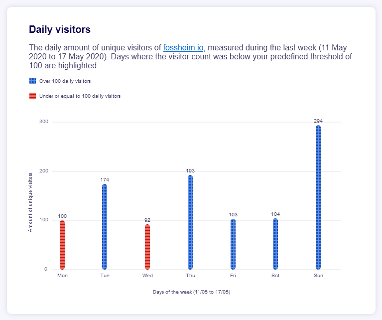
  • Using textures and patterns within graph regions where colours are not distinct enough;
  • Inclusion of a clear legend;
  • Use of a title and summary description;
  • Visible data values and axes titles;
  • Use of "ticks" for the y-axis so that it's easier to compare bars.

The final outcome looks like this:

A bar chart showing daily visitor numbers to Sarah's website. There is a headline and description at the top, detailing the period the data covers (the first half of 2020) and stating that days which had less than 100 visitors are highlighted. Below this is a legend with two entries: blue with a checked pattern for over 100 daily visitors; red with a lined pattern for under 100 visitors. The chart itself has labelled x and y axes; the y shows amount of visitors, with marked lines at 100, 200, and 300. The x-axis shows the days of the week, from Monday to Sunday in order. Each bar on the chart is colour-coded as per the legend and shows a data value at the top. These are: Monday, 100; Tuesday, 174; Wednesday, 92; Thursday, 193; Friday, 103; Saturday, 104; Sunday, 294.
It's frankly impressive how many people read Sarah's blog on Sundays! Must get that Sunday morning, breakfast-in-bed, RSS crowd 😂

On using texture or patterns as well as colours to distinguish graph regions:

If you want to be extra safe, or can't avoid using colors that meet the guidelines when it comes to colorblindness, you can also add patterns to your graphs. Make sure to not overdo it and go for calm patterns, otherwise the graph might become too busy on the eyes as well.

On where to best position legend elements:

Screen readers read the DOM elements in the order that they appear in your code. So in my example, I added the code for the legend on top, before the code for the x-axis

Explore Other Notes

  • A comprehensive guide to ensuring simple charts and graphs are accessible. Focuses on D3, but most of the tips and suggestions can easily be ported to any visual UI. These […]
  • Murray Adcock.
Journal permalink

Made By Me, But Made Possible By:

CMS:

Build: Gatsby

Deployment: GitHub

Hosting: Netlify

Connect With Me:

Twitter Twitter

Instagram Instragram

500px 500px

GitHub GitHub

Keep Up To Date:

All Posts RSS feed.

Articles RSS feed.

Journal RSS feed.

Notes RSS feed.