Indieweb icons and logos | Paul Robert Lloyd
I'm a big fan of these proposed IndieWeb icons/logos, particularly the Protocols set. The repeated node motif is just a really solid piece of logo design – and the Salmention salmon is just adorable 😄

theAdhocracy
I'm a big fan of these proposed IndieWeb icons/logos, particularly the Protocols set. The repeated node motif is just a really solid piece of logo design – and the Salmention salmon is just adorable 😄
Need to debug an iOS or iPadOS device but don't have one? Got a Mac of some kind? Turns out, Xcode is a pretty comparable environment to the real deal and almost any mobile Safari bug can be tested – in real-time, with all the normal quick reload of your regular dev environment – and fixed using it. Sure, you still have to shell out for an expensive Mac, but if you've gone that far why not get the most out of it?
An overview of the state of media queries and accessible overrides (page zoom, text zoom, min/max font size settings etc.), seeking to determine which of em, rem, or px is the best option. Turns out that Safari is still doing things differently and still preventing their being a "winner", but pixels are your most consistent option, whilst em is likely the most broadly accessible (so really, no change).
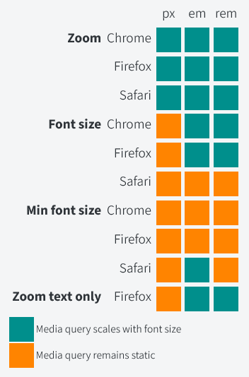
On Safari still being the core issue:
I was disappointed to see Safari is still an outlier, where ems and rems don’t scale in media queries based on the user’s default font size.
On the reality of an inconsistent system (not sure I agree with this as a takeaway, but it does track with the data):
There is no clear-cut winner I can point to after looking at this. It probably depends on what you want to prioritize.
If you want consistency across all browsers, you should now use px in your media queries.
Wattenberger frequently breaks my brain with some of their incredibly well-reasoned and unique ideas, and this talk from AI Engineer Summit is no exception. The core ideas being introduced are around how we can infuse UIs with AI in order to create new models of data capture which could automate and streamline a whole new set of tasks. I particularly love the way spreadsheets are used as a prime example of a UI that has fundamentally reinvented entire market sectors but which we never see as wholly invasive or problematic, just a useful tool that can help bring order through structure. Why not use AI to apply the same approach to non-numeric data sources?
I find it easy to think about numeric data in terms of spreadsheets, and come up with ways to cluster or show key points of information that way. A UI that could allow for that kind of data capture and interrogation across any digital source would be incredible!
I also really like the idea of these zoom-level based interfaces. It strikes me as something that you could apply to lots of information architectures – digital gardens in particular – and if you combined it with view transitions you could have some really interesting UIs, even without AI.
A thorough overview of the new success criteria added (and removed) in WCAG 2.2, including clear guidance on how to test and pass each one.
On what's changing:
There are nine new success criteria: two at Level A, four at Level AA, and three at Level AAA.
On the exceptions to obscured focus (for AA only):
If the obscuring content is semi-transparent, such that it does cover the element receiving focus, but it’s still possible to see that element because of the transparency, then this doesn’t fail 2.4.11
If users can move content regions, like draggable cards and toolbars, such that they obscure a focusable element, then the content doesn’t fail when the element receives focus, because the user caused that state.
The second is for content that’s been opened by the user, but which can be dismissed without moving focus. For example, a click-triggered top menu that’s intended to remain persistent until the user closes it, would not fail when an element underneath receives focus, if the user can close the menu without moving focus, such as by pressing ESC.
On how to best consider focus appearance to conform moving forward:
This new SC has additional requirements for the contrast between focused and unfocused states, and for the overall size of the focus indicator.
But the new SC 2.4.13 is specific about this: the difference between the focus indicator, and the same pixels it would take up when the focus indicator is not shown, must have a minimum 3:1 contrast. This is because a low-contrast change in state will be difficult for some users to discern; if an element’s focus state is visually very similar to its unfocused state, then they might not perceive the difference.
If the focus indicator is an outline, then the contrast would be compared against the surrounding background
On how to calculate non-border-based focus states (hint: very tricky, just use a border):
If focus indicators are not enclosing borders or outlines, for example, a single solid-line inside the element, or a non-rectangular boundary defined by vector graphics, then the focus indicator will pass if its total area is equivalent to a 2px perimeter.
Dotted or dashed outlines can still be used, however since they only render half the area of a solid outline, the minimum width would have to be 4px.
On drop shadows and "glow" used in focus states:
Shadow and glow effects extending outside the outline (beyond 2px in this example) are not considered, and do not need to meet contrast requirements if the solid outline does.
On whether native browser indicators still pass (hint: nope/very unlikely):
Native focus indicators, provided by the browser, will only pass if neither the indicator nor the background has been author-modified.
On how to modify drag'n'drop to work with pointer-events:
Drag and drop scripting can be designed (or retrofitted) to also support point-and-click. The user could still grab an element and drag it from A to B as before, but they could also click the element at A, release the pointer, and then click the target B, to move the element from A to B. Alternatively, draggable widgets could include actionable menus, that specify where to move them.
On the logic behind exempting native elements from target size requirements, and how that applies to custom inputs:
SC 2.5.8 does not apply to elements that are solely defined by the browser, so things like native radio controls and checkboxes are exempted, if they have no author styling. However styled or custom radio controls and checkboxes are included, because they’re designed by the author not the browser.
On how you can use a person's avatar as a form of authentication control, but not text elements like their name:
Text-based personal content is not included in this exception, because that relies on recall rather than recognition.
On how blocking pasting into login forms is now an immediate failure:
Some sites do this for ‘security reasons’, but that is now an explicit failure of SC 3.3.8 (for which no exception is allowed on the basis of security, because there aren’t actually any security issues with copy-pasting into username and password fields).
On how this may finally kill CAPTCHA:
Over and above that, it’s best to avoid using CAPTCHA or similar gatekeeping tools, which can never be fully accessible. But if you do use those things, then ensure that other forms of authentication are available; 2-Factor Authentication (2FA) is usually a good option.
On how 2FA between devices is an insta-fail, as you cannot copy/paste but have to transcribe:
So if the 2FA required a separate device, like a code sent to the user’s cellphone which must be entered into a desktop browser, then that would fail this SC.
On auto-masking password fields:
Hiding authentication information as it’s entered does not fail this SC, for example, using a type="password" field which obscures the input characters. However it is still a good idea to include “show password” functionality.A complete overview of the most recent WCAG 2.2 spec as it enters RC status, including quick overviews on the most common solutions to meet each new success criterion.
For the most part, WCAG 2.2 only introduces new success criteria, though it does also remove WCAG 2.1 4.1.1.
A quick thought: the new minimum target size has an interesting exception for inline text links, which feels suboptimal (though very understandable). I wonder if some kind of common pattern where double tapping on a text block would expand the text to meet minimum needs could be useful here? And how you would signpost such a thing so people know it's an option?
On what happens to the Parsing SC if you're still only targeting 2.1 AA:
While 4.1.1 Parsing is still in WCAG 2.1, the latest re-published version of the standard (which should coincide with the release of 2.2) will contain an advisory note for 4.1.1 Parsing, stating that the criterion should always be considered satisfied (for HTML and XML content), effectively deprecating the requirement.
On how to meet focus appearance requirements:
The simplest way to satisfy this requirement is to use an outline around the perimeter of a focused element that is at least 2 CSS pixels thick and has sufficient contrast (already covered by 1.4.11 Non-text Contrast).
On draggable interfaces, which now need multiple pointer-level options rather than just dragging:
Note that a keyboard alternative (already covered by 2.1.1 Keyboard) is not necessarily sufficient to pass this requirement. Users must be able to perform the action using mouse/touch, and can't be expected to switch to a keyboard instead.
On minimum target size versus inline links:
Inline: The target is in a sentence or its size is otherwise constrained by the line-height of non-target text;
On how to meet minimum target requirements:
Otherwise, at least provide sufficient spacing around each target: for each target, make sure that there at least a circular area with a diameter of 24 CSS pixels, centered on the target, that does not contain any other targets and does not intersect with any other spacing circles of adjacent targets.
On accessible authentication:
The simplest way to satisfy the criterion is not to have any cognitive function tests as part of an authentication process.
Remembering and entering a username and password also falls under the definition of a "cognitive function test". In these cases, the simplest way to meet the requirement is not to prevent copy/paste functionality on the login form fields, and allowing the use of password managers to autofill the fields, rather than having to manually type them in – this counts as a "mechanism". The same is true for passcodes (such as TOTP codes): a user must be able to copy/paste these, rather than having to manually transcribe them.
An extremely useful tool for comparing and visualising the specificity of a given CSS selector.
A plethora of instructional videos for all manner of backyard wetlands, from downpipe bogs to full-blown wildlife ponds designed for amphibians. Some really great tips across the board, and complements their guide on pond plants, which contains lots of advice for British natives that work well together.
Specifically on pond plants, these are the distilled pearls of wisdom:
And in terms of native plants that work well:
Also a few to avoid as they can become invasive: water milfoil, water/fairy fern, water primrose, floating pennywort, New Zealand pygmyweed, any species of balsam, common water hyacinth, skunk cabbage, cabomba, duck potato (😂), water lettuce, and (unfortunately) gunnera.
Josh may have written the perfect article on Tailwind. As someone who has also spent quite a lot of time (both professionally and personally) working with Tailwind, I couldn't agree more, particularly with the final section; every word seems to resonate. It's not that Tailwind is bad, it just breaks everything that I value and locks me off from the tools that make me most efficient.
Which is probably the one aspect of this article I would disagree with. I don't think I agree that I'm less worried with speed or efficiency on the front end. On the contrary, I find my greatest irritation with Tailwind is how slow it makes me. I'm faster using custom properties, leaning into the cascade, getting the most out of CSS power tools like Grid. Tailwind clips those wings and my efficiency with it. But for a junior dev, it is likely quicker (though I'd also argue, puts them at a disadvantage as they grow, and cuts them off from learning fundamentals that will be needed at some stage, Tailwind or not.)
On the "great divide" in front end right now:
Many who use Tailwind never want to go back; many who don’t never want to.
How could we possibly disagree so sharply?
On the analogy between Mario Kart's Smart Steering function and Tailwind:
But as you get better and better at the game, Smart Steering begins to help less and less… until eventually, it starts getting in the way instead.
The more skilled you are, the more this feature designed to augment your abilities instead begins to inhibit them.
To those sufficiently skilled with CSS, Tailwind feels like being forced to code with Smart Steering on.
On the tradeoffs involved in any decision:
But complexity always exists, even if it’s remanded to a place you don’t regularly experience it.
Problems in tech don’t vanish; they simply get reconfigured into new shapes, with new pointy edges in new places.
On the hidden complexities of Tailwind
Because Tailwind is often marketed (and spoken of by many of its proponents) as a framework that’s achieved this impossible task of obliterating CSS’s complexity from existence.
If you would make this argument, I would firmly dissent. But I would also agree you’re probably right in your case.
You likely don’t work in the areas where the tradeoffs are, so they might seem like they don’t exist to you.
On the kinds of people that advocate for Tailwind, and why the increased efficiency/simplicity is preferable in this area to them:
This also implies one or both of the following: either a) that they found this work overly challenging before; and/or b) that this is not the part of their job they wish to be challenged in.
On those that use Tailwind as a tool to augment CSS, rather than override it:
Many people who like Tailwind are also very good at CSS, but those Builders tend to be bringing a more balanced approach, where they use Tailwind for the broad strokes of utility classes, and heavily customize the config file and/or write their own CSS to fill in the gaps.
On those of us who dislike Tailwind:
But Crafters generally are less focused on getting through the frontend as a part of that work, and instead see the frontend as the product itself.
At best, it represents a hefty learning curve, just to get back to where they already are.
Where you might see a helpful copilot who keeps you on the track, I see a meddler who gets in the way at the worst possible moments.
On one of the downsides to building quickly:
In my view, the more you optimize for building quickly, the more you optimize for homogeneity.
On how native scoping, cascade layers, new frameworks, and other tools are making the problems Tailwind solves increasingly obsolete:
Point is: I think Tailwind served the world of pre-2023 frontend development quite well. I don’t expect fans or organizations to move, but I do think we’re actively outgrowing the need for it right now. Most of the answers Tailwind provided weren’t otherwise readily available at the time, but they’re now becoming more and more just parts of the platform, and of the other tools we’re already using anyway.
A useful trick when working with tokenised values is that you can generate an "immutable tuple" within a "const context" (computer science gibberish overload 😂) and reference that. So if you have a set of frequently used values, you can export them and reuse them across multiple type definitions:
export const taxonomy = ['kingdom', 'phylum', 'family', 'genus', 'species'] as const;

type Animal = typeof taxonomy[number];
A selection of possible workarounds for animating CSS values with auto keywords (e.g. height, width, etc.). Not a huge fan of the Flexbox option, but the max-height trick is a very useful one to remember (it works with min-height too, and you can use them in conjunction for some fun effects).
transition: max-height 500ms ease-out;
A useful trick for animating the height of a specific piece of content. You cannot transform a height in CSS to the auto keyword; you have to provide a fixed value, which is obviously suboptimal in most situations. Kevin's trick is to use grid row heights and the fr unit (which is animatable) to create the illusion of height manipulation.
The general code looks like this (though you'd probably use a JavaScript event to trigger the expansion, rather than hover):
<style>
    section {
        display: grid;
        grid-template-rows: 0fr;
        transition: grid-template-rows 500ms;
    }

    section > div {
        overflow: hidden;
    }

    section:hover {
        grid-template-rows: 1fr;
    }
</style>

<section>
    <div>
        <h2>Title</h2>
        <p>Content goes here</p>
    </div>
</section>
The trick here is really the overflow property (and I did find it was possible to tweak this back to auto or scroll, but it's less smooth).
In testing, yes you can animate multiple rows in different ways, use other keywords like max-content, and generally play around with this technique quite a lot. Though there may be dragons; Chrome in particular does weird things with Grid animations if there are multiple rows, and you can't tweak timing that much (though you can use keyframe animation to do a similar thing and tweak timing there, again with caveats and Chrome weirdness).