A New Mozilla [#4]

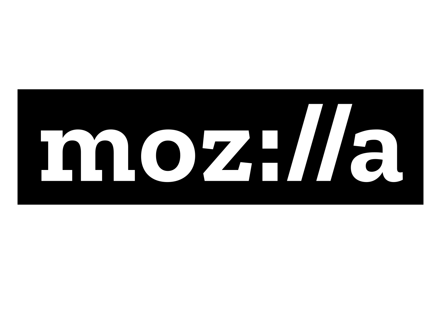
Mozilla's new logo, for me, is a rebrand done extremely well. The moment I saw the design the concept struck me as clever, appropriate and intelligent. Styling the "ill" part of their name to mimic the :// of a hyperlink is brilliant; it is simultaneously memorable and informative, hopefully helping people to see Mozilla and their popular product, Firefox, as two distinct entities. Others may see it as a dad joke, but to me it's inspired.
The methodology used for the new logo is also pretty inspired, with Mozilla using their rebrand to run a progressive experiment. Since June, the entire process has (apparently) been done out in the open, for the entire world to see. Their logic is two-fold: they are an open source company, so their brand identity should follow similar methodology, and doing so enables on-the-fly user testing from day zero. Both arguments are pretty sound ones and I would love to see other organisations adopt a similar approach.
However, I say "apparently" designed in the open as there isn't much evidence. As I've mentioned, I didn't catch the experiment whilst it was ongoing, so I don't know what the website used to house. Right now, though, all I could easily find was some basic information on why they had gone this route and some of the reasoning behind the final design, largely based on a write up by the design firm themselves. There is a timeline showing when major milestones were achieved, but these don't link anywhere. I would have expected that clicking on "Concepting" (apparently a word now...) would have taken me to a portfolio of rough drafts and prototypes, but there's nothing of the sort.
Perhaps it's a little greedy of me to want a full break down of the entire process, especially after the fact. After all, opening up to even this extent deserves applause. Plus, to take their open source roots one step further, the bespoke (and rather lovely) 'slab-serif' typeface used throughout their branding is to be released, free of charge, for anyone to use. It's called "Zilla" and I will definitely be keeping my eye out for it. Top marks all round!
